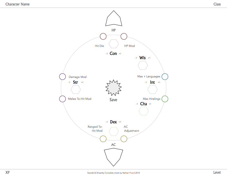
Experimental Swords & Wizardry Character Sheet

Developing low tech character sheets is a great way to explore user experience design. For such a foray, I chose to create a sheet for Swords & Wizardry Complete. It's very much an experiment and a work in progress.
One goal is to provide as much affordance to the player as possible, all the way from basic through expert. The sheet should help introduce new players to the game while remaining useful as their S&W expertise grows.That route runs through simplicity, more specifically, the ability to customize the core sheet by hand.
Old school games like Swords & Wizardry tend to see a lot of house ruling. The character sheet has to have flexibility built-in in order to accommodate things that may not be anticipated during development. Also, can one sheet be used by all classes as-is while fulfilling all the necessary functionality?
As the designer, I'd like the sheet to look like something more than an artifact of play at the game table. If it could be seen in the game world, it should look like some interesting document from a dusty old stack. But I don't want it to explicitly look like it's been designed as such.
Whew, that's a serious set of self-imposed parameters. With them in place it was time to get cracking.
I sat down and sketched out a general design idea that had been bouncing around in my head for some time. That idea arranged the attribute list in a circular pattern in the middle of the paper. In about an hour, the first iteration was put together on the computer and landed at the gaming table ready to roll. It felt pretty good, utility was evident, but not everything felt right. It was clear that the attributes needed reordering. At first, I thought that I could simply distribute the list clockwise or counter-clockwise, and I'd be off to the races. It looked great, but once the secondary bits (max hirelings, HP mod, etc.) were grouped nearest their respective attributes, the sheet felt awkward. On top of those things, some of the key graphic elements simply weren't good enough to support the overall concept.
With a game session under my belt, I set out to improve the design with a second iteration and that's where the project is currently at.


