Learn how one of our talented artists illustrates d-Infinity.
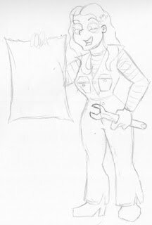
Readers of d-Infinity are no doubt familiar with my writing, but I want to take a moment to discuss illustrating our quarterly multi-platform game supplement. I've been creating illustrations for d-infinity since Volume #0, and in that time I've worked with a variety of styles. However, the upcoming Volume #4 at last gives me license to work in my favorite style. At heart, I am cartoonist, and I could think of no better way to illustrate the humorously slanted article "A Flawed Tomorrow", a guide to science fictions character Defects. As is usually the case, the illustration begins with an idea. In this case the idea was Paradox Prone, a Defect for robots, androids, and AIs rendering them vulnerable to logical paradoxes and aggressive nonsense. I knew immediately that I wanted the illustration to feature a plucky young scifi heroine using a simple and easily recognizable visual paradox to defeat a spike-covered warbot. With that idea in mind, I created the following loose sketch.

I find it useful to begin with a loose sketch because at this stage in the process flexibility is important. No matter how clearly I may be able to envision the finished illustration in my head, it only really matters how it looks on paper. From the sketch I can see what works and what doesn't, play with the composition, and erase and redraw with impunity until the sketch is suitable for inking.

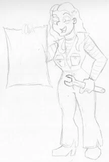
As you can see from the above early inked version, changes have been made. Specifically, the breast pockets have been changed from two bulky pockets to a one streamline zip pocket. I felt the original two pocket design was distracting and overcomplicated. When cartooning, simplicity is king. If you can indicate something with fewer lines, use fewer lines. Speaking of lines . . .
There are two stages to the inking of my work. The first inks are done to turn the soft pencil sketch into hard line. The second stage, done with a much thicker pen, is done to block out the overall shape of the character and significant props, as well as provide the illusion of depth. As you can see, the paper held by our hero "pops" into the foreground of the image due to its increased line weight.
From this point, there is nothing left to do but scan the inked image and color it in photoshop. This is the most boring part of the process and the only one involving a computer. However, it does enable one of the most important parts of the creative process: cheating!
Yes, I'm serious. You see, I wasn't satisfied with the warbot I had drawn to confront our heroine. I much preferred the warbot I'd drawn in a much earlier and ultimately abandoned version of the illustration. Rather than try to redo the drawing from scratching to combine my two favorite elements, I inked and scanned the warbot from the unfinished version, then pasted it over the lackluster bot. The result is the image you see above. The pixelation is intentional. If you want to see what visual paradox is sending our warbot into paroxysms of self-destructive confusion you'll have to check out "A Flawed Tomorrow" in
d-Infinity Volume #4.
