Creating a Character Sheet for Swords of Infinity

I love a good character sheet. I have said before that one of the main factors that will swing my decision as to whether or not I purchase an RPG is the layout of the character sheet. It is a great way to show a snapshot of the game, even without any stats. A quick glance will usually tell me if I'm going to find a game that's my cup of tea or not. To me, a good character sheet will have all the necessary notes you will need to run the game smoothly as a player, and a great character sheet will also include thematic art to help your immersion - even if it just has funky shaped boxes.
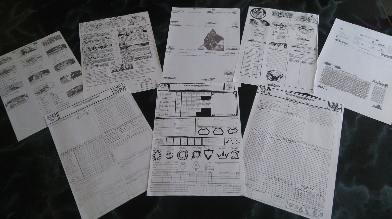
I started designing my own character sheets back in the 90's. I found that with the release of new game supplements I liked to play, there would inevitably be some new rule or stat that wasn't on the character sheet. So I attempted to make my own. I'd pester my mother to take my books into work where she would do photocopying for me. She followed my instructions very well ("I don't need the whole page, just this guy's shield as clear as possible"). I know it makes me sound like a Grognard but this was back when 'cut and paste' literally was just that!
Here are some examples of character sheets I've done for the Lone Wolf RPG and 2nd edition AD&D:

With varying degrees of success I slowly learned that, luckily for me, you didn't need to be great at art to create something that was both aesthetically pleasing and did the job it was supposed to do. I remember seeing a Christmas card competition a few years back. The only rule was that it had to have a Santa in it. The winning entry wasn't the best drawn, but it was absolutely the cleverest. The entrant had kept it simple and drawn a pair of boots and legs sticking out of a decorated fireplace. It didn't need any more because the card treated its audience intelligently enough to know who it represented. It was really neat and taught me an important lesson that applies to designing character sheets - it doesn't have to include absolutely everything, it just has to do enough.
Now, it's one thing to design a character sheet for a game you have been playing for decades, but it is another altogether entirely to design one for a game you are not that familiar with (but would like to try)! I have been watching Brendan run his Monday night group through the Swords of Infinity playtests. I really like the rules and would like my group to try something like it but realize there is no actual character sheet in the SRD: http://soi.skirmisher.com/index.php?title=Swords_of_Infinity
So with a combination of watching the playtests and reading the SRD I thought I might have a go at knocking out a character sheet of my own. It is a great way to discover what is important in a game. First of all I started making notes, lots of notes. I do anyway for when I get an RPG idea; the nearest available scrap of paper gets written on (hence my three daughter's post-it notes in the shape of hearts!):

Now there are a few things going on here that haven't made it to the final sheet. I thought there was a spot check figure, that's why I was including the Wadjet eye to begin with, especially as it is composed of the senses (yes, I know that's Aegyptos but it's close enough and my players will probably end up there at some point fighting typhonic beasts). There is not a spot as far as I can see so I must have imagined it. I also wanted room for a character portrait and, rather than just a box, thought a ewer or amphora would look nice as these are of course decorated with heroes (the non-artistic could just put a symbol or description instead). I left it out because of space restraints.The main six Ability Scores (Strength, etc.) I originally thought of using an Infinity symbol to keep in-theme; the wording in one loop and score in the other. I then realized that players needed to know their Physical and Mental Resistance made up from a combination of physical and mental stats. It made the most sense to have the three relevant scores on the outside and the resistance derived from them in the middle. I wanted to keep the infinity loop, a sort of triple infinity loop. but so far my artistic ability has let me down, haven't completely abandoned the idea yet. On the left I've started making a cheat sheet for rules that don't need to go on the character sheet but are important (the kind of stuff a GM would have on the inside of their screen). For instance, an unarmed character gets a +10 bonus to striking but as it applies to ALL characters, it didn't seem important enough to go on the character sheet (if the game had classes or something like that which affected this bonus differently, then it would absolutely need to go on the character sheet - something like warrior +10, wizard -10, etc.). Other things for the cheat sheet include the cost to buy actions, how much power it takes to increase targets & rounds, and the increasing difficulty of crafting. Considered a Minotaur head box for Defects but, well, that's another box to try and squeeze in and the skills box can be used for the same thing in an opposite way. Like an RPG, keep the sheet as simple as it needs to be.
My original design had the Ability Score triad in a 'Y' shape but changed it to more of a caltrop because, to me, it seemed to look like a uterus with the infinity loops, didn't look right. It was important to have Dexterity then Strength and Intelligence then Personality because these characteristics are used to determine whether a physical or magical attack hits and the power it does respectively. I eventually put Strength at the top though and Vitality lower down because Vitality forms the basis of many things. Dexterity is affected by Armour so I needed a box very close by to show that - 99% of the time the characters are in armour so it needs to be noted but occasionally they won't be - like if they are wrestling in a carnival or disturbed from sleep perhaps.I also wanted to add the swimming penalty for armour. True, only the Storyteller needs to know how the penalty is calculated if it turns up but as a Player, to me, it is important to know the penalty BEFORE you take the action. Likewise I should have put the number of rounds you can hold your breath near Vitality. Also meant to spell Armour as Armor; never mind, all ideas for version 2.
I used the Necropolis and Swords of Kos Campaign Setting products to get some fantastic images for the sheet. Note, due to copyright issues, I asked permission from Skirmisher beforehand. If you are planning on making your own character sheets (and I hope you do) remember anything not your own work is protected by the copyright laws. I don't think it's an issue if it is for personal use (it isn't in the UK) but you cannot reproduce this work or post it online for others to see without permission, even if you do not charge anything.
The important things as far as I know in the game are; Ability Scores & Resistances, Damage Locations (physical), Morale (mental damage), Armour penalties, Skills/Abilities, Equipment and BLANK SPACES. Why blank spaces? Every game I have seen has, at some point or another, required someone to note something down that doesn't fit into any other box on the character sheet. A recent example comes from Brendan's playtest - Parthenia was branded by an Anubis-like foe with the marks of Wrath and Thief (which caused her all manner of strife), later she redeemed herself by earning the favoured marks of Ajax, Odysseus and an Amazon Queen. Keeping a little bit of blank space will allow you to write these things down so that they are handy to reference but also do not interfere with the rest of your sheet. Also, a bit of space helps to avoid a cluttered appearance, which in turn makes it easier to see what you are looking for when otherwise you cannot see the wood for the trees.
I started with the corners - the sword from Swords of Kos, Skirmisher's trademark, Swords of Infinity design and my own Triangular icon I put on all my character sheets. The large sword design makes an excellent box for the character name and is large enough to write the 'concept' of the character too (too keep within the Swords of Infinity theme). 'Parthenia, Elven Barbarian' or 'Alchemical Rogue Paros' are examples of what I mean. I needed an good image of a person for the hit locations. Here are some of the one's I almost selected:

Parthenia and Selene would make good substitutes for the one I eventually chose, as the final image was male, I will probably do a female version alternative when I have finished the design. As Brendan said a while back, every decision you make about a game potentially alienates a bunch of fans and I don't want someone to think this game is just for guys. Many of the images worked fine, the final one I chose works particularly well because the arms and legs are just out from the body enough to mark as distinct hit locations but tucked in so as not to impose on the surrounding space, and space on a character sheet is like gold dust. The man with the trident in particular appeals to my OCD nature because his right arm is on the right and left on the left and so on. If only I had an artist friend who could draw the exact figure I needed. I did consider having a half and half character with one side masculine, the other feminine, if my artistic ability was better that's the one I'd go for.
Various shields provided the boxes for armour and wound stats and I thought a medusa head would be rather appropriate to represent morale damage because it looks great and again suits the theme. That particular picture is drawn from a larger one for the Gorgon's Head tavern on page 124 of the campaign setting. Skills and abilities and equipment I figured would take up the lion's share of the sheet. I used a caduceus and owl for skills - indicating some knowledge, magic and lore plus a caduceus applies to healing and the owl is the symbol of Athena so martial and military skills would also be appropriate here too. For the equipment I used a helmet to indicate permanent items, including armour and weaponry, and a scroll to show everything else, including consumables. Value Levels seem extremely important when playing this game, for bribes and crafting, etc. So I placed the Value Level before even the Item's Name to help keep these figures clear.
Here is the completed version one of the Swords of Infinity Character Sheet I will be attempting to use in my games. N.B. This is still a work in progress, there are a ton of changes I want to make but first I need to playtest it to see what I actually need rather than what I think I need.

On the whole I'm rather satisfied how it has turned out. Kicking myself for spelling Armour my way and forgetting the Holding Breath box (I might use the volcano/cataclysm for that because smoke is just as relevant and the drawing makes an excellent box). The Ability Scores I would like to link the boxes with a triple Infinity symbol as I said, to me it looks like the spaceship from Blake's Seven. I also should have put these essential Ability Scores in all-capital letters. I considered extra boxes at the hit locations to show armour for each section but a combination of space and the thought that some folks will be happy to just list that under equipment made me change my mind (myself, I would put the armour value in brackets in the box). There are various boxes that need to be larger or smaller and at the moment doesn't quite fit A4. I am also thinking about putting the skills box at the top third, the equipment in the bottom third and everything else in the middle for balance - or even a landscape character sheet with skills on the left and equipment on the right. Putting the skills before the Ability Scores makes sense because Brendan asks "this is an X skill check, if you don't have that skill just use Y ability score", so Skills first would help a player see quicker, even though most other system's character sheets begin with Ability Scores near the top or left hand side.
Again, this is very much still a work in progress and I can only share how it looks so far thanks to the generosity of Skirmisher Publishing. I will be sure to show you an updated version as and when I finish it.
How about the rest of you? Have you tried to design/re-design a character sheet for an RPG? What sort of things went well and what didn't?


